
Hi everyone! I'm Sara Mika...aka Mock Pie Studio! If you're looking for the Florabunda! Blog Hop you came to the right place!

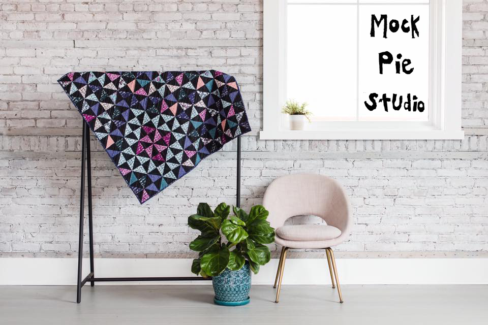
Welcome to my Happy Space...Mock Pie Studio!

I was as high as the cow who jumped over the moon when Melanie Testa asked me to design a quilt using her new Florabunda! line through RJR Fabrics. First of all, did I mention it's MELANIE TESTA'S line?!??? I've admired her work for years...of course I'm in! Secondly, look at these designs! Melanie hand carves stamps and hand prints them onto fabric. Her signature style IS this collection...it's a true work of art in itself! Her designs are bright, bold, and FUN with a capital F-U-N! She has achieved what most artists strive their whole career for...recognizability! When you see Melly's work, you just KNOW it's hers and with Florabunda!, it can be yours too!

Here's a bit of the quilt I designed using several Florabunda! fabrics. I call it "Kaliedoscope" and you'll see why in a sec.
While designing Kaleidoscope, I knew I wanted to work with half square triangles, and tons of them at that. I came up with a few simple rules to follow regarding which way the Florabunda! patterns would run in the overall design. Naturally, this sent my head spinning when cutting and piecing these babies, so I'm not sure how "simple" it was in the end, but I do admire how it lends a sense of order to an otherwise busy design.
The first rule was that the Zig Zaggle-Coal print would always run diagonally. This would be true whether the diagonal in the half square triangle ran bottom to top or top to bottom. This print appears in every half square triangle in my design.

I used Florabunda! Brick fabric in several color ways, but made sure it always ran horizontally in my design.

The other Florabunda! prints I used run vertically including Polyantha-Bluette, multiple Zig Zaggles, Ivies, and Tendrils.

Here is the complete digital representation of my Kaleidoscope design. Do you see how the colors seem to radiate out from the pink and blue diamonds in the upper right hand corner? Mentally, I almost want to spin this pattern like I'm turning a real Kaleidoscope and watch the colored triangles tumble around!

In order to follow the predetermined rules I had set for myself, I basically ended up cutting and pairing each Zig Zaggle-Coal triangle (cut on the diagonal) with it's corresponding Florabunda! print one half square triangle at a time. I meticulously followed my original design so as to achieve the desired Kaleidoscope effect. Once the half square triangles were together, I pieced them first into rows, then pieced the rows together until...

….voila! A finished quilt top!
(Can you see me in this pic?!)

Here she is all quilted and bound. Notice how I deviated from my original design by adding a bit of Brick-Bengal Rose to the binding in the lower left corner. If you refer back to my original design above, you'll see that the binding was supposed to be all Brick-Dusty Plum. But, an artist can't be expected to follow ALL the rules, not even ones they self impose!

Here's a close-up of the teensy matchstick quilting I did. Took FOREVER, but it was worth it...I LOVE the look!

On the reverse, you can see how much of the quilting runs in a diagonal across the surface, with the exception of the area where the two diamonds are. The quilting follows the shape of the blue diamond and runs vertically through the pink diamond.

Two of my favorite steps...the label and the binding.
(Why are they my favorite, you ask? Because it means I'm almost done!)

If you're interested in creating your own Kaleidoscope quilt designed by Sara Mika/Mock Pie Studio using Melanie Testa's Florabunda! line, RJR Fabrics is offering a free pattern here.
Thank you so much for stopping by!
Be sure to visit and like all Florabunda! Blog Hoppers on Instagram, including @RJRFabrics @QuiltyBox and @MellyTesta, to increase your chances of winning swag! @RJRFabrics will post chances to win Florabunda! swag daily June 11-16, so check their Instagram often to up your odds!
Check out Melanie Testa's blog each day, too. This is where you will get highlights and interesting nuggets about each participant...with pictures!
June 7 - Tiffany Hayes
June 8 - Deborah Boschert
June 9 - Mock Pie Studio
June 10 - Lyric Montgomery Kinard
June 11 - Kathy York
June 11 - Teri Lucas
June 12 - Leslie Tucker Jenison
June 15 - David Gilleland
June 15 - RJR Fabrics
June 16 - Melanie Testa


